Data Visualizations
Charts and graphs for run 20260123_110159_Rb5Vko
How to Interpret
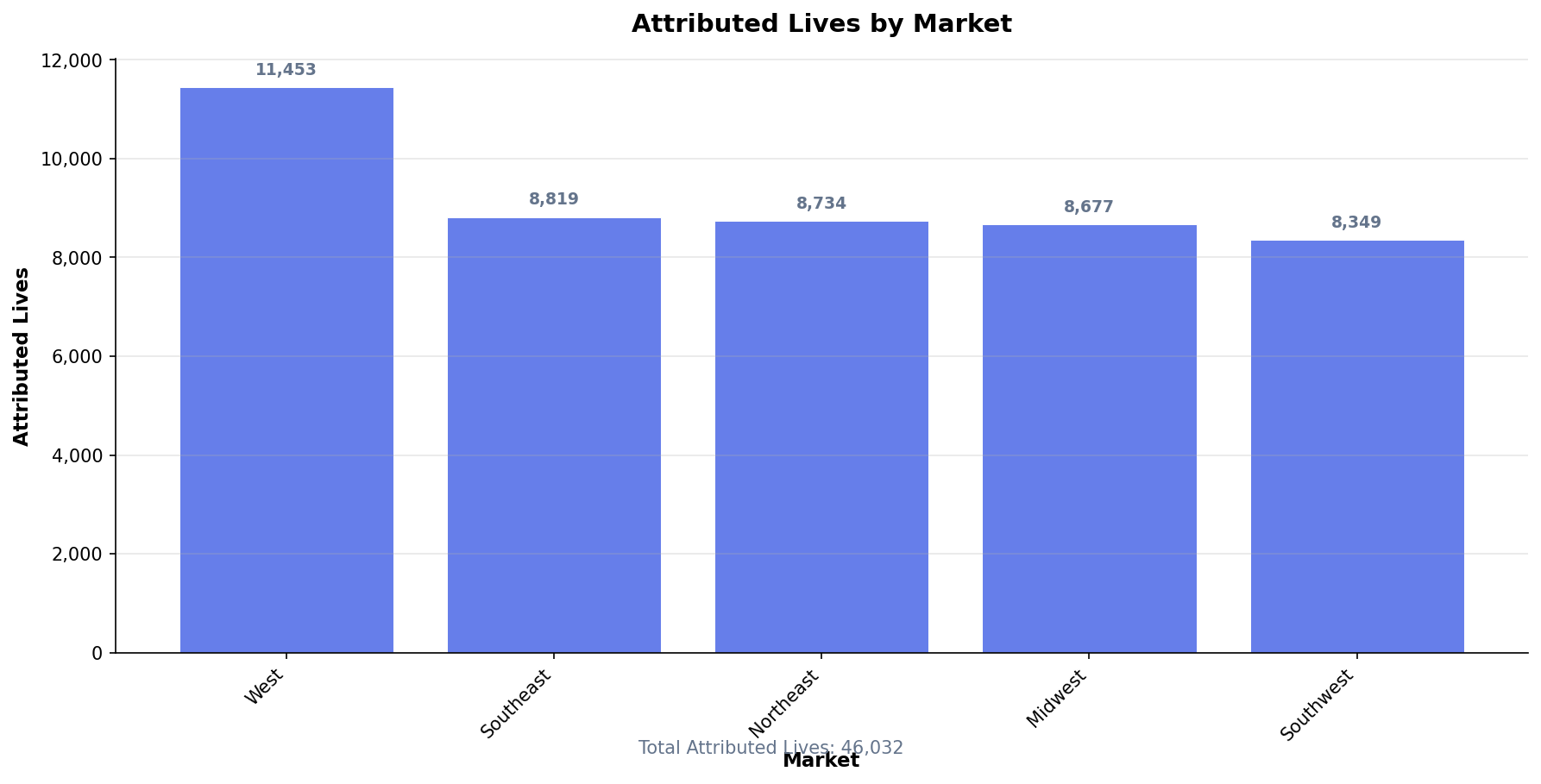
This bar chart shows the distribution of attributed members across different markets.
- Taller bars indicate markets with more attributed members
- The total at the bottom shows the sum across all markets
- Use this to identify your largest markets and ensure attribution is distributed as expected
- Significant changes from prior periods may indicate contract changes or data issues
How to Interpret
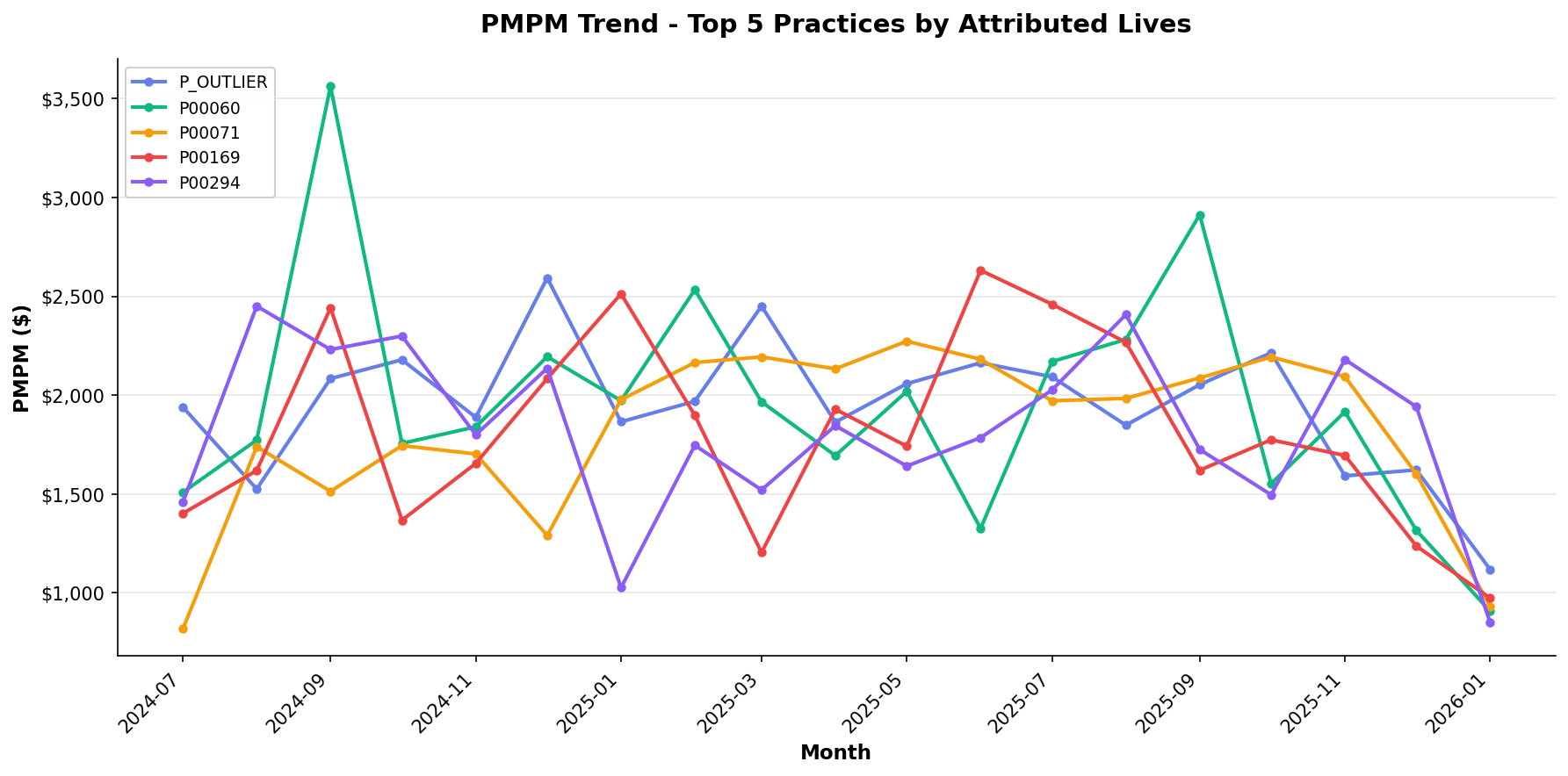
This line chart tracks Per Member Per Month (PMPM) costs over time for the top 5 practices by attributed lives.
- Upward trends may indicate increasing costs or sicker populations
- Downward trends may suggest successful cost management
- Seasonal patterns are common (higher utilization in winter months)
- Compare practices to identify outliers or best practices
- Recent months may show lower PMPM due to claims lag
How to Interpret
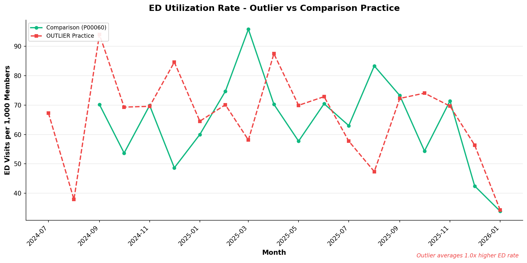
This chart compares Emergency Department visits per 1,000 members between an outlier practice and a comparison practice.
- The dashed line represents the outlier practice
- The solid line represents a comparison (high-volume) practice
- Higher ED rates may indicate access issues, care gaps, or sicker populations
- Look for consistent gaps vs. temporary spikes
- Consider patient demographics when interpreting differences
How to Interpret
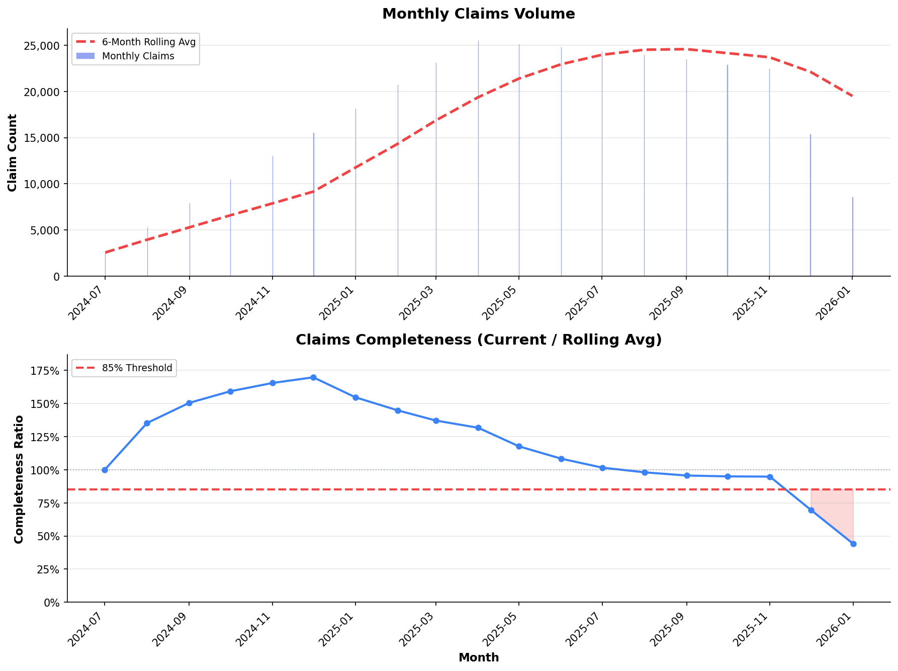
These charts show claims volume and completeness ratio to assess data maturity.
- Top panel: Monthly claim counts vs. 6-month rolling average
- Bottom panel: Ratio of current month to historical average
- Values below 85% (red zone) suggest incomplete data
- Recent months typically show lower completeness due to claims lag
- Allow 60-90 days for claims to fully mature before drawing conclusions
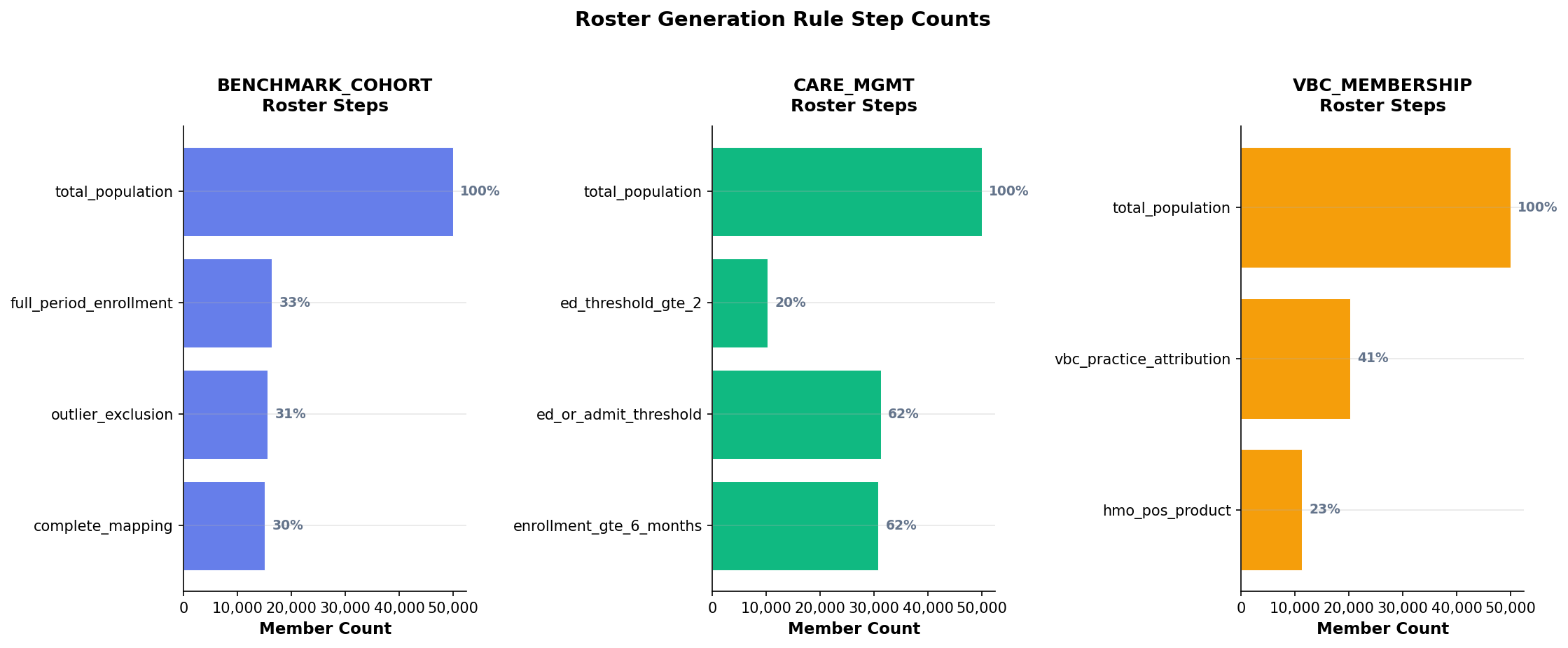
How to Interpret
These horizontal bar charts show how members flow through roster generation rules.
- Each roster type (VBC, Care Mgmt, Benchmark) has its own funnel
- Percentages show what portion of the starting population remains at each step
- Large drop-offs between steps indicate restrictive rules
- Compare across periods to detect rule changes or data issues
- Use this to understand why certain members are excluded
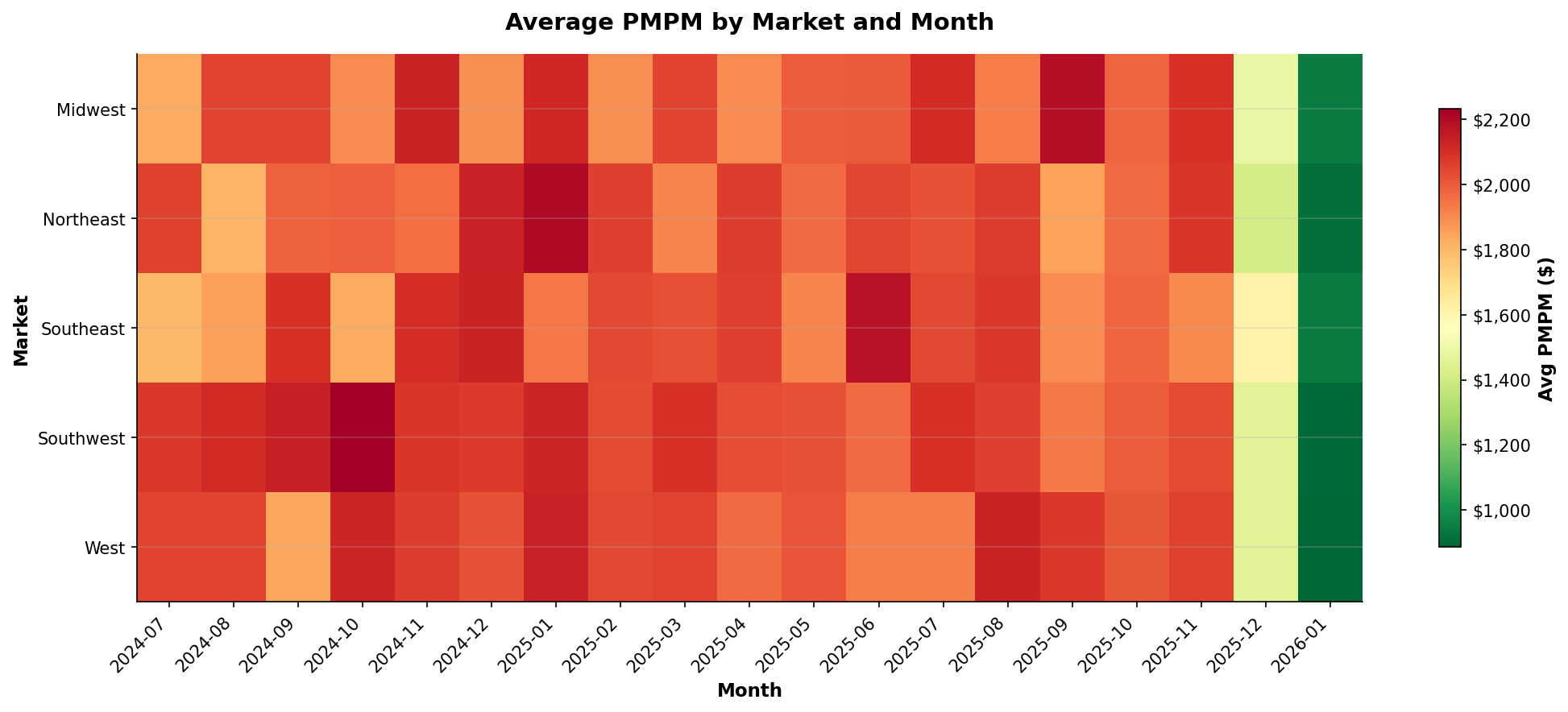
How to Interpret
This heatmap shows average PMPM by market and month, allowing quick identification of cost patterns.
- Red/darker colors indicate higher costs
- Green/lighter colors indicate lower costs
- Look for horizontal patterns (market-specific issues)
- Look for vertical patterns (seasonal trends)
- Outlier cells may warrant deeper investigation